Having a white kitchen can be clean, modern and stylish. However, there is nothing wrong with adding splash of colour into areas of your kitchen to create a fresh and updated look! Two-colour combinations are the perfect way to do this; a simple refresher that can be a huge boost to an out-dated kitchen, and that’s why we have put together 12 different colour combinations to take inspiration from.
Sea and Sky
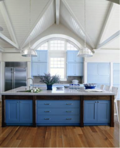
Photo by John M. Hal; (paint dabs) Brian Henn/Time Inc. Digital Studio
One approach is to use two shades of the same colour. For example, in this large open-plan kitchen (above, designed by architect Stuart Disston) the deep-blue island takes centre stage, whilst the sky-hued cabinets define the perimeter. These custom shades were chosen by interior designer Sherill Canet to ground the high ceilings as well as harmonise with the stainless-steel appliances and the island’s bands of dark wood.
Barn Red and Sage Green
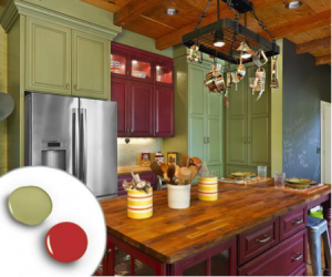
Photo by Jeffrey Volker; (paint dabs) Brian Henn/Time Inc. Digital Studio
Another complementary colour combination is the classic soft, muted tones, as chosen by kitchen designer Carlie Korinek. Without border lining a Christmas theme, this barn red and sage green combination creates a classic finish. Also, the wood finishes on the island, ceiling and floor also help to (as seen above) warm up the overall palette.
Leaf Green and White
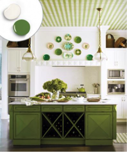
Photo by Eric Piasecki/Otto; (paint dabs) Brian Henn/Time Inc. Digital Studio
The vibrant leaf green island (above) holds takes centre stage in this crisp white kitchen. However, interior designer Gideon Mendelson didn’t want the island to stand alone: therefore, he covered the ceiling with custom-painted canvas (for the same effect wallpaper works just as well) in a matching green-and-white colour scheme. Along with plates hun over the cooktop, it invites the eye to “travel” around the room.
Bold Blue and Soft Blue
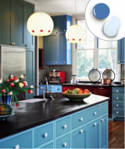
Photo by Eric Roth; (paint dabs) Brian Henn/Time Inc. Digital Studio
To add some “oomph” to the simple Shaker-style cabinets in this kitchen, (above) architect Adolfo Perez used pale blue on the cabinet boxes and a deeper shade on the doors and drawer fronts. This has resulted in a pure cottage charm.
Bright Red and Midnight Black
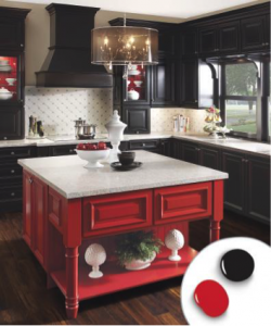
Photo by Courtesy of KraftMaid Cabinets; (paint dabs) Brian Henn/Time Inc. Digital Studio
This red and black colour combination adds a dramatic touch: created by KraftMaid, this combination has created a balanced feel thanks to a pairing of equal-intensity colours. Black cabinets effectively fade into the background in order to show off the red kitchen island in the centre of the room, whilst a light backsplash and countertops helps keep the painted pieces from feeling too heavy.
Cool Grey and Hot Orange
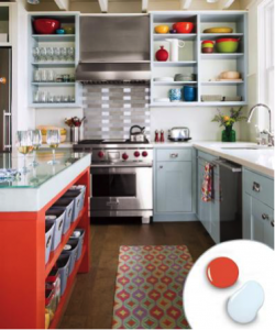
Photo by Eric Roth; (paint dabs) Brian Henn/Time Inc. Digital Studio
A changeable colour – is it blue or grey? This particular choice of colour adds a splash of interest into an otherwise neutral choice, and holds enough of that interest to stand on its own. But combined with the fiery orange (above) that interior designer Andra Birkerts has added to the island has created a stark contrast. Painting the backs of the open shelves a lighter tint of the same grey adds depth and helps showcase the bright orange accessories.
Lemon and Lime
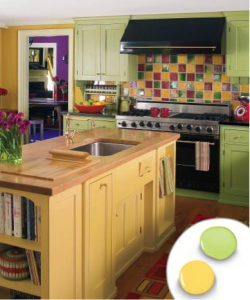
Photo by Eric Roth; (paint dabs) Brian Henn/Time Inc. Digital Studio
Vibrant colours reign supreme in homeowner Nancy Traversy’s kitchen, (above) where bold green perimeter cabinets and the sunny yellow island are united by the room’s multicolour tile backsplash. Dark granite and light wood counters help focus the attention on the cheery palette, and this colour combination has given the kitchen a sense of Spring.
Deep Aqua and White
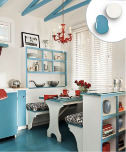
Photo by Mark Lohman; (paint dabs) Brian Henn/Time Inc. Digital Studio
Despite being crisp and clean, having too much white in a colour palette will only blur a room’s details. To highlight the architecture of the space, interior designer Kelly LapLante used a mid-tone blue to ground the floor and define the ceiling trusswork (see above). The same colour has been used on the cabinet doors and the built-ins’ exposed edges helps bring these charming features to the forefront of the design.
Pale Grey and Greenish Blue
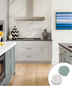
Photo by Eric Roth; (paint dabs) Brian Henn/Time Inc. Digital Studio
In order to give this kitchen some “zing” without overwhelming the colour-shy homeowner, interior designer Liz Caan used a neutral grey on the cabinets before painting the island a dusty green-tinged blue. Grey-veined marble on the island countertop and range backsplash has helped tie the two areas together in a soft and modern finish.
Flame Red and Soft Yellow
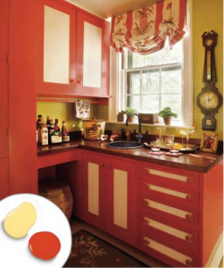
Photo by Eric Roth; (paint dabs) Brian Henn/Time Inc. Digital Studio
This punchy warm-toned scheme was chosen by interior designer Liz Mitchell in order to brighten this corner bar, just off the kitchen (above). Using a light yellow paint-glaze mix on the panels has added dimension to the bright orange-red cabinets. Green wallpaper makes the colours “pop” even more, while a rich mahogany countertop has kept the look from appearing too whimsical.
Cornflower and Yellow
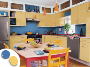
Photo by Eric Roth; (paint dabs) Brian Henn/Time Inc. Digital Studio
Golden cabinets get a brightness boost set against a soothing deep-blue backdrop in this kitchen (see image above), created by Morse Constructions. By using the blue on the backs of the open shelves they have added depth to the kitchen, whilst a sliver of white trim above and below the yellow cabinets and a row of glass-front cabinets up top has leant a sense of airiness.
Jadeite and Buttermilk
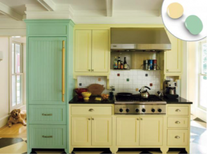
Photo by Eric Roth; (paint dabs) Brian Henn/Time Inc. Digital Studio
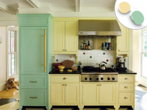
In order to achieve this look of a farmhouse kitchen (above) stocked with furniture pieces, architect John Tittmann has used soft colours to highlight distinct sections of the cabinet. The cooktop area has been defined with pale yellow; beadboard panels and a vintage green has distinguished the fridge unit. Accent tiles has married the colours used in the room.

